Intro
Nothing made a bold choice for a startup phone company — it launched a midranger! Jokes aside, the flagship Nothing Phone (2) was well-received, but it’s still a niche device. Yet, Nothing was confident enough to launch the affordable $350 Phone (2a) — almost half off the MSRP of the Phone (2), which starts at $600.
Quick note, at the time of writing this, the Phone (2) is discounted and you can grab the 12 GB / 256 GB model for $550.
OK, so corners had to be cut to make the Phone (2a) so affordable. Does it manage to deliver the core Nothing experience? Is it much worse than the Phone (2) or does it maybe excel in some areas (hint, nudge, the camera!)? Let’s explore!
Nothing Phone (2a) vs Phone (2) differences explained:
| Nothing Phone (2a) | Nothing Phone (2) |
|---|---|
| Full plastic build, Gorilla Glass front | Metal frame, glass sandwich |
| Smaller, 3-segment Glyph Interface | Full Glyph over the entire back |
| MediaTek Dimensity 7200 Pro 12 GB / 256 GB (US model) |
Qualcomm Snapdragon 8+ Gen 1 8 GB / 128 GB 12 GB / 256 GB 12 GB / 512 GB |
| 50 MP camera, but new algorithms | 50 MP camera |
| 5,000 mAh battery | 4,700 mAh battery |
| No wireless charging | Wireless charging and reverse wireless |
Table of Contents:
Design and Display Quality
Secrets of The Glyph
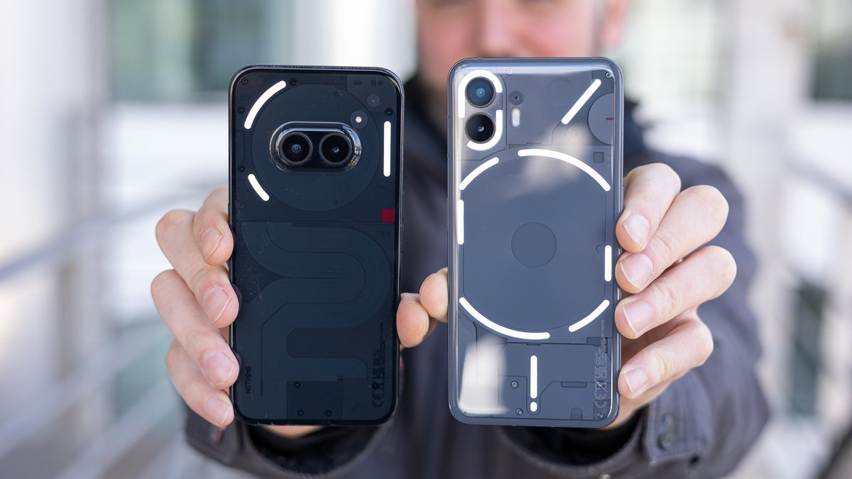
Even if the Nothing Phone (2a) has a plastic build, its design absolutely carries that Nothing DNA. To the point where picking them up cold from the desk and just looking at the two phones from the front — you could be easily confused which is which. The Phone (2a)’s frame has this grainy matte finish, which adds a better feel to it, and its bezels are as thin as the flagship’s.
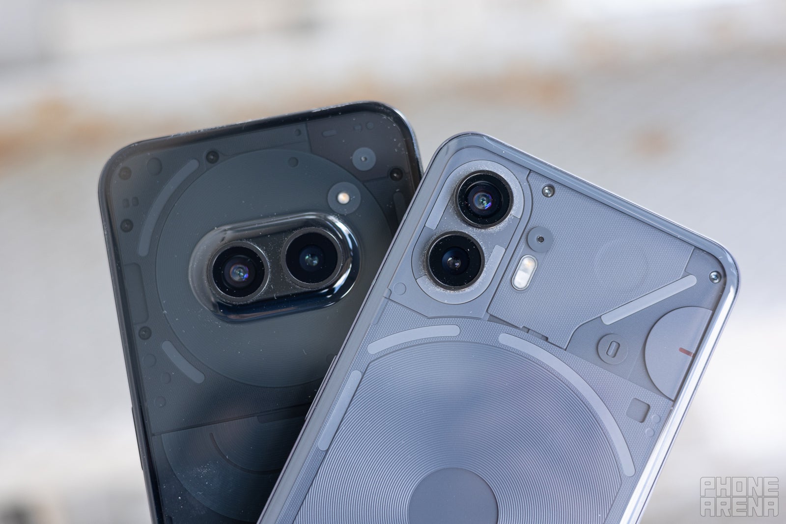
On the back, we have some big differences with the capera placement and that divisive bump that the Nothing Phone (2a) has. We don’t mind it and we think it looks better in person — or at least it has been easy to get used to. The Glyph design is obviously also very different on both. The good news is that the (2a) has a strip for the Glyph Timer feature, where you can flip the phone over and watch a glowing progress bar track time for you. The only feature you will miss (at least for now) is the tiny LED strip at the bottom, which tracks charging progress on the Phone (2).
Glyph Timer is now a core Nothing feature (Image credit – PhoneArena)
The plastic back does have that warm feel to it that’s not as premium on the glass of the Phone (2). But it’s interesting that Nothing budgeted for a Gorilla Glass 5 panel on the front, protecting the Phone (2a) like it’s the premium Phone (2). Both of these devices also have IP54 rating — limited dust ingress protection and resistance to water splashes.
Both phones have 6.7-inch AMOLED screens, which look pretty much identical. They also have dynamic refresh rates, difference being that the Phone (2a) goes from 30 Hz to 120 Hz, while the flagship Nothing Phone (2) has the wide range of 1 – 120 Hz. Both are rated for HDR10+, have a 1080p resolution, and a 240 Hz touch sampling rate. Obviously, the Phone (2a) did not go with a lower quality screen, and that’s pretty important — the screen is your main way of interacting with the phone.
Display Measurements:
For biometrics, both phones have an optical fingerprint scanner under the screen and they seem to be of the same quality. They work relatively quickly and are mostly accurate — we would sometimes get misreads on either device, that would require an extra scan or two. But we wouldn’t say that the Phone (2a) does this more often than the Phone (2).
Performance and Software
Midrange shows its colors
Performance Benchmarks:
The only situations where we could truly see the Phone (2a)’s performance struggle — when taking a photo and going in to preview it, it takes quite a while for the phone to process it. And also, there’s some touch input delay when gaming.
Is the Nothing Phone (2) faster? Well, yes — it has a flagship chipset. The Snapdragon 8+ Gen 1 may be a couple of generations behind now, but it used to be the top dog of 2022, and it’s still better than a midrange chip of today. The Phone (2) is snappier, has better touch response, and is much more resilient when you throw heavy tasks at it.
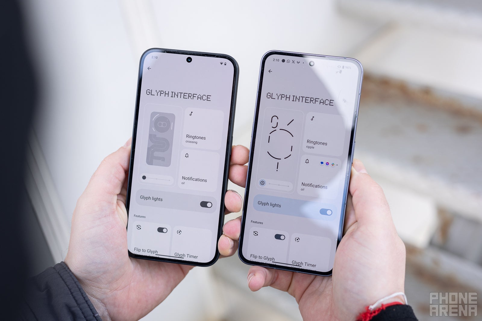
The Nothing interface fits the style of the Phones perfectly (Image credit – PhoneArena)
You can also download the Glyph Composer for both these phones and create your own ringtones, with glowing Glyph patterns. At its core, the Phone (2a) delivers that Nothing experience fully, with the same aesthetics and overall vibe of both the software and hardware.
Both phones were released with a promise for 3 years of Android OS updates and 4 years of security patches. This means that the Nothing Phone (2) will end support in 2027, the Phone (2a) should last into early 2028. For Android builds — the Phone (2) should tap out at Android 16, Phone (2a) might get Android 17.
Camera
Same sensors, different ways to deal with them
Peek a boo (Image credit – PhoneArena)
On paper, both phones have the same main camera — a 50 MP sensor under a lens with an F/1.88 aperture. In reality, they have different chipsets, therefore process photos differently. Nothing talked up its Ultra XDR engine — an evolution of HDR+ — that’s been developed for the Phone (2a). Does this mean that the Phone (2) is left in the dust? Which one has the better camera? The photos will tell us!
Main Camera – Day
Main Camera – Low-light
At night they kind of trade blow for blow. The Phone (2a) can look a bit hazier around the edges. Both are not perfect at night, but the Nothing Phone (2) does manage to get sharper and slightly more realistic images more often than the new guy.
Both of these lack a dedicated zoom camera, so it’s inevitable that their zooms are purely digital. They hit their maximum at 10x magnification and we were honestly expecting pretty similar results from both. However, the Phone (2) holds it together better, overall. At 2x zoom, you can already see the Phone (2a) amping up those sharpening skills, with details like branches, grass, and leaves starting to look jagged. At 10x, the Phone (2a) photos fall apart a bit more than the Phone (2) ones. Mind you, none of these are masterpieces, but the flagship at least gives you a clearer idea of the object you were zooming in on.
Selfies
On the selfie side — surprise, surprise — slightly different specs. Both have 32 MP sensors, but the Phone (2a) has a slightly wider aperture at F/2.2, compared to F/2.45 on the Phone (2). The actual performance? Let’s see:
In the daytime, with a good amount of light, the Phone (2a) can grab a bit more details from the face — pretty interesting. It does go just a bit heavy on the saturation, though. The Phone (2) keeps the colors closer to reality — that’s cool — but looks a little bit softer. Some fine (unflattering) details in the face are lost and my beard looks just a bit hazier.
Video Quality
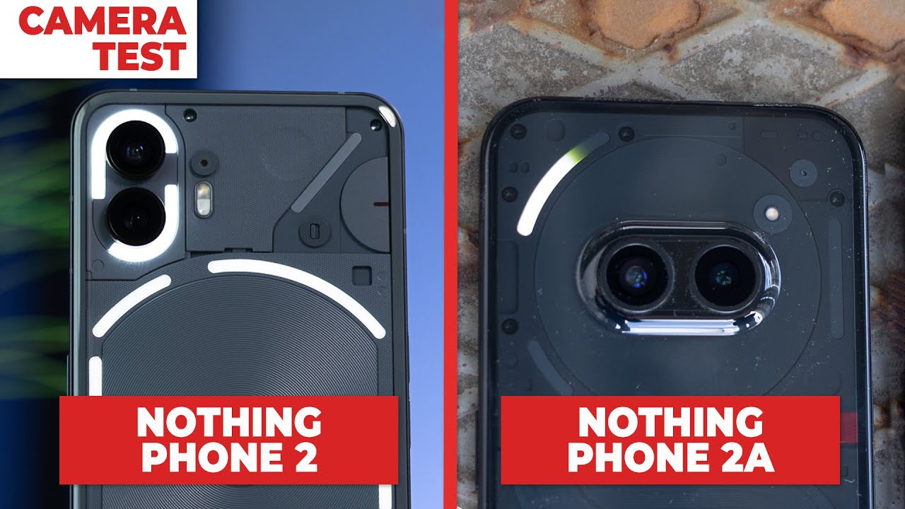
The main camera differences are even more pronounced on video. The Phone (2a) overexposes and saturates a lot — probably due to a lack of processing power, required for the 4K 30 FPS video samples above. Stabilization is kind of similar on both phones, but again — the (2a) is a bit wonkier with keeping up with focus while also combating shaky hands.
At night, however, the quality of the Phone (2) footage does drop and the Phone (2a) may look more attractive simply because it managed to pull more light in. But don’t walk around and record video at night with either of these phones — it becomes quite shaky.
Audio Quality and Haptics
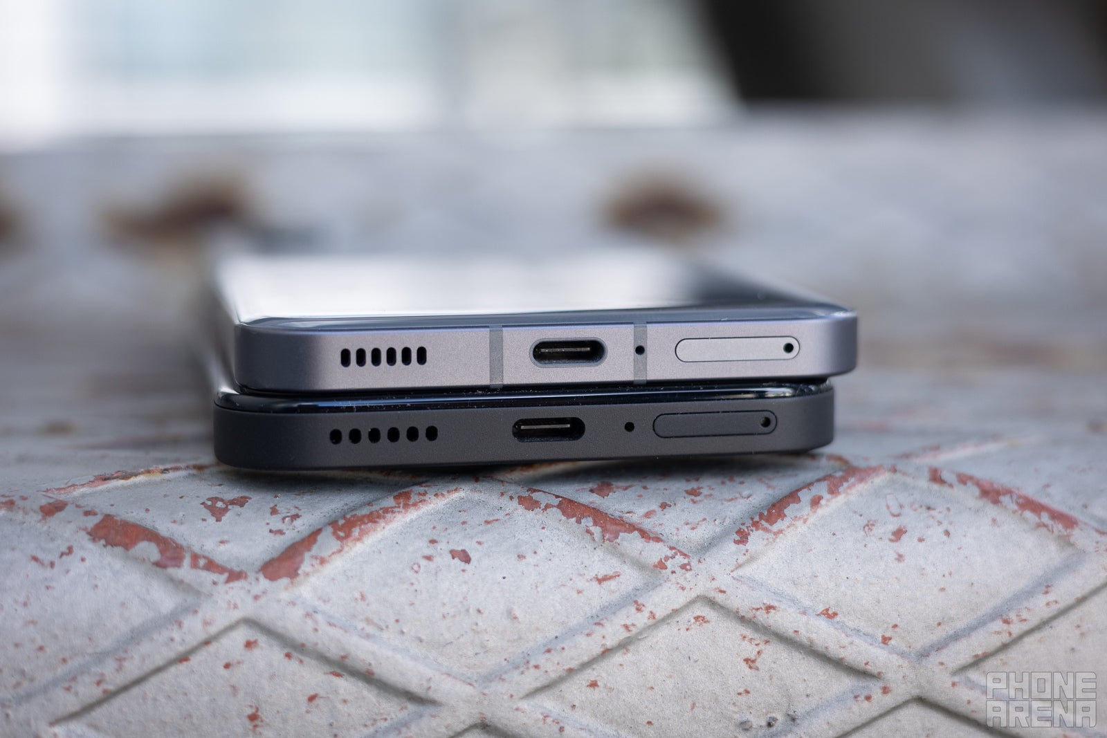
Same speaker setups, neither wows (Image credit – PhoneArena)
The Phone (2)’s speakers have a bit more roominess and bass to them, but just a bit. They don’t have the same mid hump as on the Phone (2a), which makes them sound as if they lack in volume, but at least they don’t get fatiguing after prolonged listening sessions. These are also not great for music, but work fine with the phone’s interface.
The haptics on both devices are great — quick and precise clicks that work in tandem with the Glyph patterns for very satisfying ringtones and interaction.
Battery Life and Charging
The Nothing Phone (2a) has a slightly bigger 5,000 mAh battery, over the 4,700 cell in the Phone (2). And it has a lower power processor. Logic dictates it should last longer, yes? Well, not if we stress-test it with our battery benchmarks –
PhoneArena Battery Test Results:
The good news is that, when using it as a casual daily driver, it seems like the Phone (2a)’s battery just goes on and on and on. We would say that both of these handsets have a very reliable battery endurance.
Both support up to 45 W charging — the wallplug that Nothing sells on its website. And both have battery health optimizations in place, which is why we think we couldn’t squeeze the max charging speed out of the Phone (2a).
No wireless charging coil in the Nothing Phone (2a), so… it kind of loses in this category by default.
Specs Comparison
OK, so let’s get the good ol’ dry specs battle out of the way. Obviously, the 50% cheaper Phone (2a) will have different hardware, right? Well, here’s what those differrences are:
| Specs | Nothing Phone (2a) | Nothing Phone (2) |
|---|---|---|
| Dimensions | 6.41 x 3.00 x 0.34 in (162.74 x 76.32 x 8.55 mm) |
6.38 x 3.01 x 0.34 in (162.1 x 76.4 x 8.6 mm) |
| Weight | 6.70 oz (190.0 g) | 7.10 oz (201.2 g) |
| Screen | 6.7 inches, AMOLED 2412 x 1084, 30-120 Hz |
6.7 inches, AMOLED 2412 x 1084, 1-120 Hz |
| Processor | MediaTek Dimensity 7200 Pro, 4 nm, 2.8 GHz | Qualcomm Snapdragon 8+ Gen 1, 4 nm, 3 GHz |
| RAM, Storage and Price | 12 GB / 256 GB – $349 | 8 GB / 128 GB – $599 12 GB / 256 GB – $699 12 GB / 512 GB – $799 |
| Cameras | 50 MP main 50 MP ultra-wide 32 MP selfie |
50 MP main 50 MP ultra-wide 32 MP selfie |
| Battery Size | 5,000 mAh | 4,700 mAh |
| Charging Speeds | 45 W wired | 45 W wired 15 W wireless |
The Phone 2a does come in slightly different RAM and storage variations, depending on where in the world you are. In the States, you need to register for the Developer / Tester program and you can nab it for $350, but only in one variant — 12 GB / 256 GB.
Summary and Final Verdict
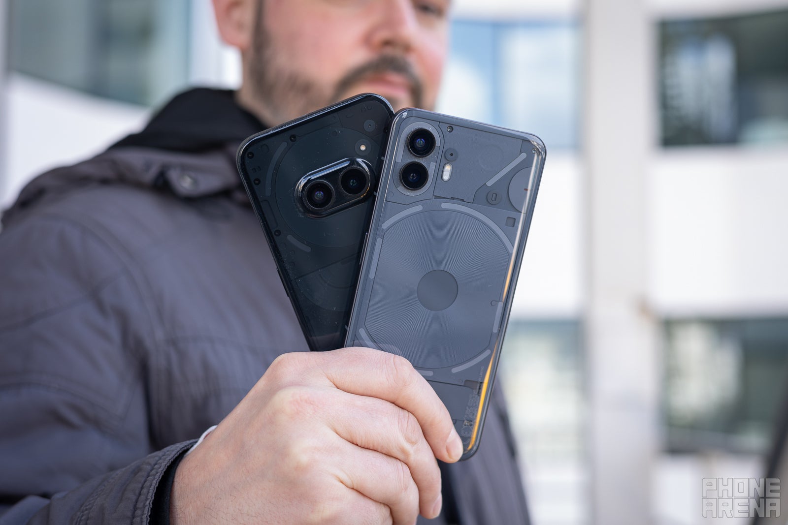
Which one? (Image credit – PhoneArena)
Final verdict — if you can spare the extra cash, the Nothing Phone (2) is still worth the leap. If you are on a budget — the Nothing Phone (2a) is just fine and it will serve you well and look cool doing it.
